
The magic of choosing an EFFECTIVE visual
In this digital age, where information overload is the norm, it has become increasingly crucial to present data in a way that captures attention, conveys insights, and drives meaningful action.
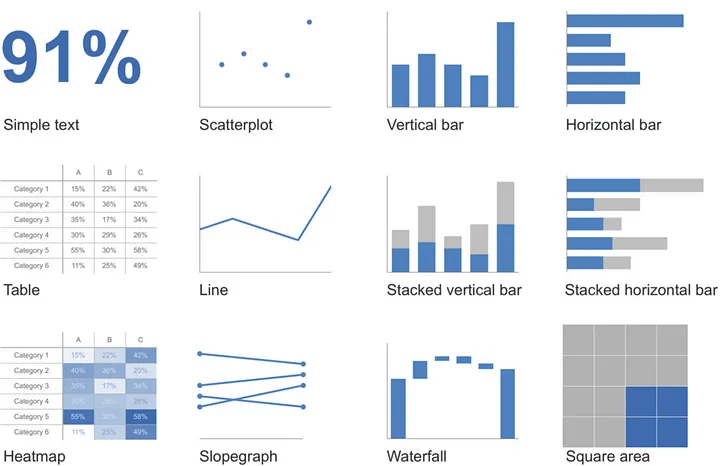
Visuals possess an incredible ability to transform complex datasets into meaningful stories, making them accessible and engaging to a wide audience. However, with an array of visual options at your disposal, it’s essential to understand the strengths and weaknesses of each type to make an informed decision. In this article, we will explore twelve key visualizations: simple text, scatterplot, table, line chart, heat map, slope graph, vertical bar, horizontal bar, stacked vertical bar, stacked horizontal bar, waterfall, and square area. By understanding the purpose and characteristics of each, you will gain valuable insights into when and how to use them effectively.
Whether you’re a data analyst, business professional, or simply someone interested in enhancing your data communication skills, this blog post will equip you with the knowledge and tools to confidently select the most suitable visual representation for your data. Follow me on Medium, where I share insightful articles and valuable tips on harnessing the power of data visualization to make informed decisions. Let’s dive in!
Simple text
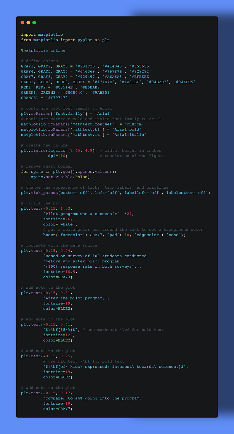
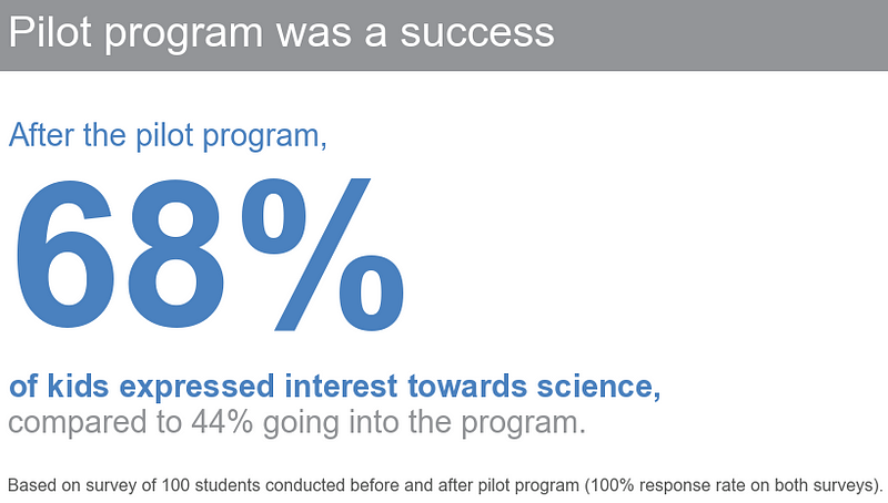
If you have only one or a few numbers to share, using simple text can be an effective method of communication. It’s important to emphasize the number itself and provide a few supporting words to convey your message clearly. Simply placing one or a couple of numbers in a table or graph can potentially be misleading and diminish their impact. When you need to communicate one or two numbers, it’s best to rely on the numbers themselves.
When you only have one or a few numbers to communicate, it’s best to present them directly. However, when dealing with larger sets of data, tables or graphs are generally more suitable. One thing to understand is that people interact differently with these two types of visuals. Let’s discuss each in detail and look at some specific varieties and use cases.
Tables
Tables are designed to be read as part of our verbal system. When we encounter a table, we tend to visually scan across rows and down columns or compare values. Tables excel at communicating information to diverse audiences, allowing each person to easily locate their specific row of interest. Furthermore, if you need to present multiple units of measurement, tables typically offer a more straightforward approach compared to graphs.
PRO TIP: Using a table during a live presentation is generally not recommended. When the audience focuses on reading the table, their attention shifts away from your verbal message. When incorporating a table into a presentation or report, it is important to consider the main point you are trying to convey. In most cases, there are better ways to highlight and visualize the relevant information. If you feel that omitting the entire table would result in significant loss, consider placing it in the appendix and providing a reference or link for your audience’s convenience.
When designing a table, it is crucial to ensure that the visual elements do not distract from the data itself. Avoid using heavy borders or shading that may compete for attention. Instead, opt for light borders or utilize white space to distinguish different elements within the table.
Borders in a table should serve the purpose of enhancing legibility. Consider making them grey or eliminating them altogether to allow the data to take center stage. The focus should be on the information presented, rather than the borders themselves.
Heatmap
One approach for mixing the detail you can include in a table while also making use of visual cues is via a heatmap. A heatmap is a way to visualize data in tabular format, where in place of (or in addition to) the numbers, you leverage colored cells that convey the relative magnitude of the numbers.
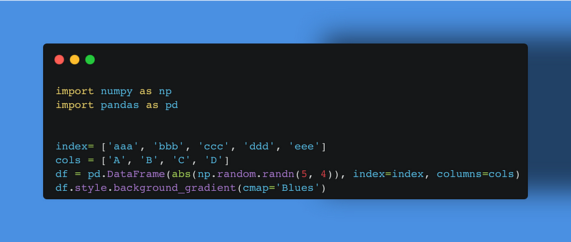

Color saturation provides visual cues, helping our eyes and brains more quickly target the potential points of interest. On the Heatmap, the higher saturation of blue, the higher the number. This makes the process of picking out the tails of the spectrum — the lowest number (0.2) and highest number (2.25) — an easier and faster process to direct our attention.
Graphs
Although tables engage our verbal system, graphs engage our visual system, which is known for its faster information processing. Consequently, a well-designed graph generally conveys information more quickly than a well-designed table. As mentioned earlier in this chapter, there is an abundance of graph types available. The positive aspect is that a few of these graph types will suffice for most common requirements.
The types of graphs experts frequently use fall into four categories: points, lines, bars, and area. We will examine these more closely and discuss the subtypes that experts find themself using on a regular basis, with specific use cases and examples for each.
Points
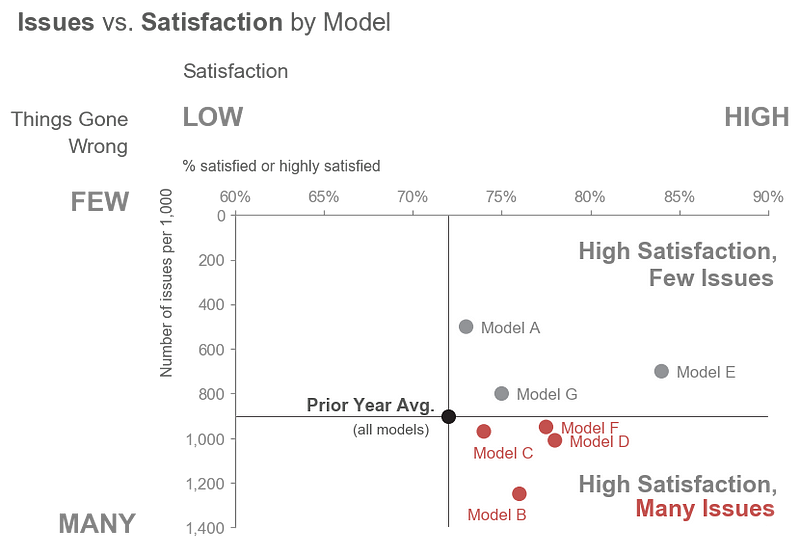
Scatterplot
Scatterplots serve as a valuable tool for illustrating the relationship between two variables by representing data simultaneously on both the horizontal x-axis and the vertical y-axis. They are commonly employed in scientific disciplines to examine relationships, although they may appear complex to individuals less acquainted with them. Though infrequent, there are use cases for scatterplots in the business world as well.
Lines
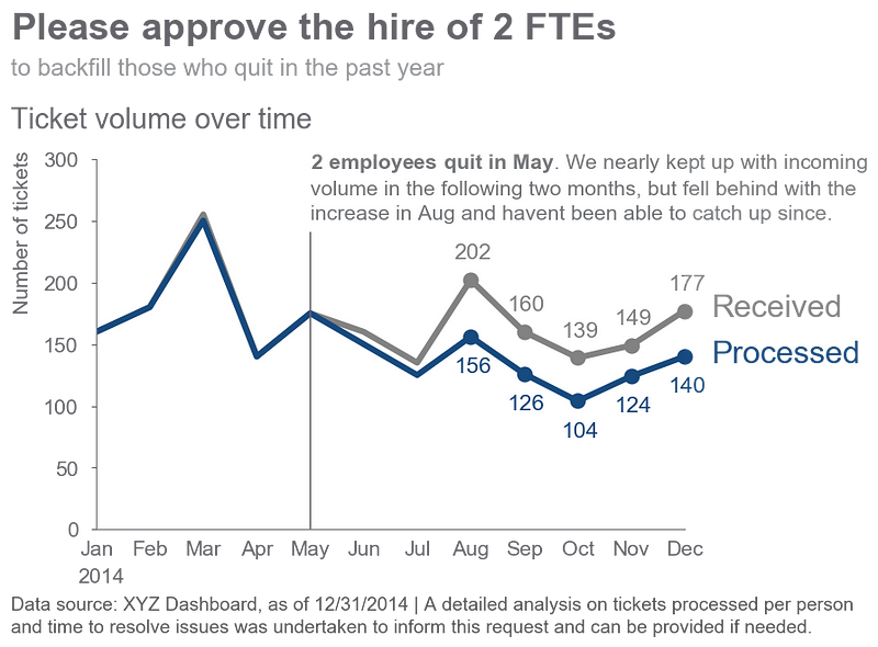
Line graphs are frequently employed for representing continuous data. The connected line between the points implies a relationship that may not be meaningful for categorical data, which consists of data sorted or divided into different categories. Continuous data is often measured over time, such as days, months, quarters, or years.
Within the line graph category, there are two types of charts that data visualization specialist frequently find themself using: the standard line graph and the slopegraph.
Line graph
The line graph can show a single series of data, two series of data, or multiple series
PRO TIP: In some cases, the line in your line graph may represent a summary statistic, like the average, or the point estimate of a forecast. If you also want to give a sense of the range (or confidence level, depending on the situation), you can do that directly on the graph by also visualizing this range.
Slopegraph
Slopegraphs can be useful when you have two time periods or points of comparison and want to quickly show relative increases and decreases or differences across various categories between the two data points.
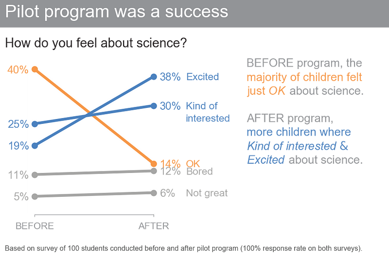
Slopegraphs pack in a lot of information. In addition to the absolute values (the points), the lines that connect them give you the visual increase or decrease in rate of change (via the slope or direction) without ever having to explain that’s what they are doing, or what exactly a “rate of change” is — rather, it’s intuitive.
PRO TIP: Whether a slopegraph will work in your specific situation depends on the data itself. If many of the lines are overlapping, a slopegraph may not work, though in some cases you can still emphasize a single series at a time with success. For example, we can draw attention to the single category that decreased over time from the preceding example.
Bars
Bar charts should not be avoided simply because they are common. In fact, their familiarity makes them advantageous as there is less learning required for the audience. Bar charts are easy to read, allowing for quick comparison of categories based on the endpoints of the bars. It is important to ensure that bar charts have a zero baseline to avoid misleading visual comparisons.
PRO TIP: When graphing data, a common decision to make is whether to preserve the axis labels or eliminate the axis and instead label the data points directly. In making this decision, consider the level of specificity needed. If you want your audience to focus on big‐picture trends, think about preserving the axis but deemphasizing it by making it grey. If the specific numerical values are important, it may be better to label the data points directly. In this latter case, it’s usually best to omit the axis to avoid the inclusion of redundant information. Always consider how you want your audience to use the visual and construct it accordingly.
While we’re considering lengths of bars, let’s also spend a moment on the width of bars. There’s no hard‐and‐fast rule here, but in general the bars should be wider than the white space between the bars. You don’t want the bars to be so wide, however, that your audience wants to compare areas instead of lengths.
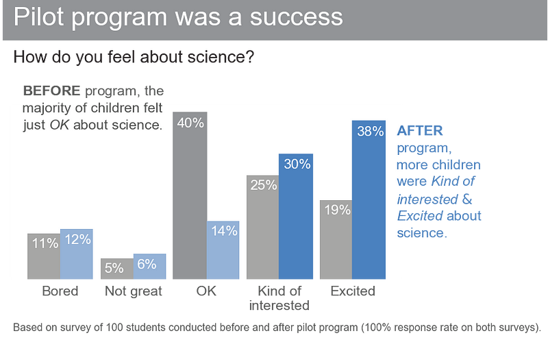
Vertical bar chart
The basic type of bar chart is the vertical bar chart, also known as a column chart. Similar to line graphs, vertical bar charts can consist of a single series, two series, or multiple series of data. However, it is important to exercise caution when using multiple series bar charts as it can become challenging to focus on and derive insights from each series individually. Additionally, the spacing in bar charts with multiple data series results in visual grouping, making the relative order of categorization significant. When creating a bar chart, carefully consider the desired comparisons and structure the categorization hierarchy to facilitate easy understanding for the audience.
Stacked vertical bar chart
The usage of stacked vertical bar charts is relatively limited. They serve the purpose of comparing totals across categories while also providing visibility of the subcomponents within each category. However, using stacked vertical bar charts can quickly become visually overwhelming, particularly due to the varied default color schemes in most graphing applications. It becomes challenging to compare the subcomponents across different categories, especially beyond the bottom series adjacent to the x-axis, as there is no consistent baseline for comparison. This complicates the comparison for our visual perception.

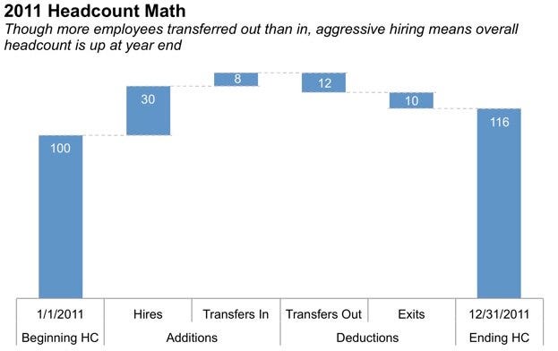
Waterfall chart
The waterfall chart can be used to pull apart the pieces of a stacked bar chart to focus on one at a time, or to show a starting point, increases and decreases, and the resulting ending point.
Horizontal bar chart
If I had to choose a single preferred graph for categorical data, it would be the horizontal bar chart, which is a flipped version of the vertical bar chart. The reason for this choice is its exceptional readability. The horizontal bar chart is particularly beneficial when dealing with long category names, as the text is aligned from left to right, following the natural reading pattern of most audiences, ensuring legibility. Additionally, considering our typical information processing pattern, where our eyes start from the top left and move in a zigzag pattern across the screen or page, the structure of the horizontal bar chart allows us to encounter the category names before the actual data. This enables us to understand what the data represents by the time we reach it, eliminating the need for constant eye movements between the data and category names, as required in vertical bar charts.
Like the vertical bar chart, the horizontal bar chart can be single series, two series, or multiple series
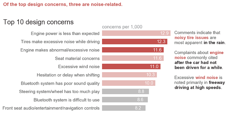
PRO TIP: When designing any graph showing categorical data, be thoughtful about how your categories are ordered. If there is a natural ordering to your categories, it may make sense to leverage that. For example, if your categories are age groups — 0–10 years old, 11–20 years old, and so on — keep the categories in numerical order. If, however, there isn’t a natural ordering in your categories that makes sense to leverage, think about what ordering of your data will make the most sense. Being thoughtful here can mean providing a construct for your audience, easing the interpretation process.
Your audience (without other visual cues) will typically look at your visual starting at the top left and zigzagging in “z” shapes. This means they will encounter the top of your graph first. If the biggest category is the most important, think about putting that first and ordering the rest of the categories in decreasing numerical order. Or if the smallest is most important, put that at the top and order by ascending data values.
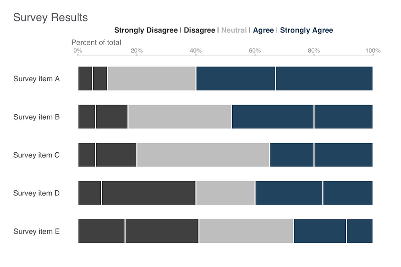
Stacked horizontal bar chart
Just like the stacked vertical bar chart, stacked horizontal bar charts can be employed to display totals across various categories while also providing insights into the subcomponents. These charts can be organized to present either absolute values or proportions that sum up to 100%.
Experts have found that the latter approach is effective for representing portions of a whole on a scale ranging from negative to positive. This is because the consistent baselines on both the far left and far right facilitate straightforward comparisons of both the leftmost and rightmost components.
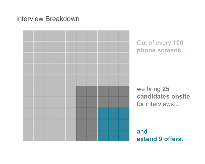
Area
Specialist generally steer clear of using area graphs. Human perception struggles to accurately assign numerical values to two-dimensional space, making area graphs more challenging to interpret compared to other visual displays we have discussed. As a result, specialists typically avoid them, except for one scenario: when there is a need to visualize numbers that vary significantly in magnitude. The additional dimension provided by using squares (which have both height and width, unlike bars that have only one dimension) enables a more concise representation of such data compared to using a single dimension.
To be avoided
We’ve discussed the visuals that Data Visualization Specialist use most commonly to communicate data in a business setting. There are also some specific graph types and elements that you should avoid: pie charts, donut charts, 3D, and secondary y‐axes. Let’s discuss each of these.
Pie charts are evil
Pie charts are strongly criticized due to several issues they pose for accurate data interpretation. The application of 3D and strange perspectives in pie charts distorts the perception of the sizes of the pie pieces, making some appear smaller or larger than they actually are. Even when the 3D effect is removed, challenges in interpreting the data persist. The human eye struggles to assign quantitative value to two-dimensional space, making it difficult to determine the relative sizes of close segments and quantify the differences between larger segments. Although data labels can be added to aid interpretation, some argue that the visual representation of pie charts is not worth the space it occupies.
Never use 3D
One of the fundamental principles of data visualization emphasizes avoiding the use of 3D, with few exceptions. Adding a third dimension can complicate data interpretation and comparisons. In the case of a single dimension, using 3D distorts the numbers and hinders their understanding. The inclusion of 3D elements in graphs introduces unnecessary distractions such as side and floor panels. Graphing applications often exhibit peculiar behavior when plotting values in 3D, making it even more challenging to interpret the visual representation accurately.
Secondary y‐axis: generally not a good idea
There are instances where plotting data with different units on the same x-axis is useful. This situation often leads to the consideration of using a secondary y-axis, positioned on the right-hand side of the graph. However, using a secondary y-axis can cause confusion and hinder data interpretation. Instead, two alternative approaches can be employed: labeling the data points directly without showing the secondary axis, or separating the graphs vertically with separate y-axes on the left side while maintaining the same x-axis for both.
Finally
In conclusion, choosing an effective visualization is crucial for effectively communicating data and insights. By considering the nature of the data, the intended message, and the target audience, one can make informed decisions on which visualization type to use. It is essential to align the chosen visualization with the data’s characteristics and leverage the strengths of each type to enhance clarity and understanding. Additionally, avoiding common pitfalls such as using excessive 3D effects or cluttering the visual with unnecessary elements can significantly improve the effectiveness of the chosen visualization. Ultimately, selecting the right visualization is an art that requires thoughtful consideration and practice, but it can greatly enhance the impact and persuasive power of data-driven narratives.
Reference:
http://www.storytellingwithdata.com/book/
https://github.com/adamribaudo/storytelling-with-data-ggplot